All work
Landing page, education

Selling a course to people who distrust courses

A conversion landing page for Flex Academy, where the founders of The Flex and Base360 teach how to build a short-term rental business. The audience is sceptical of guru courses, so every decision had to earn trust.

Client
Flex Academy
Year
2026
Platform
Desktop and mobile
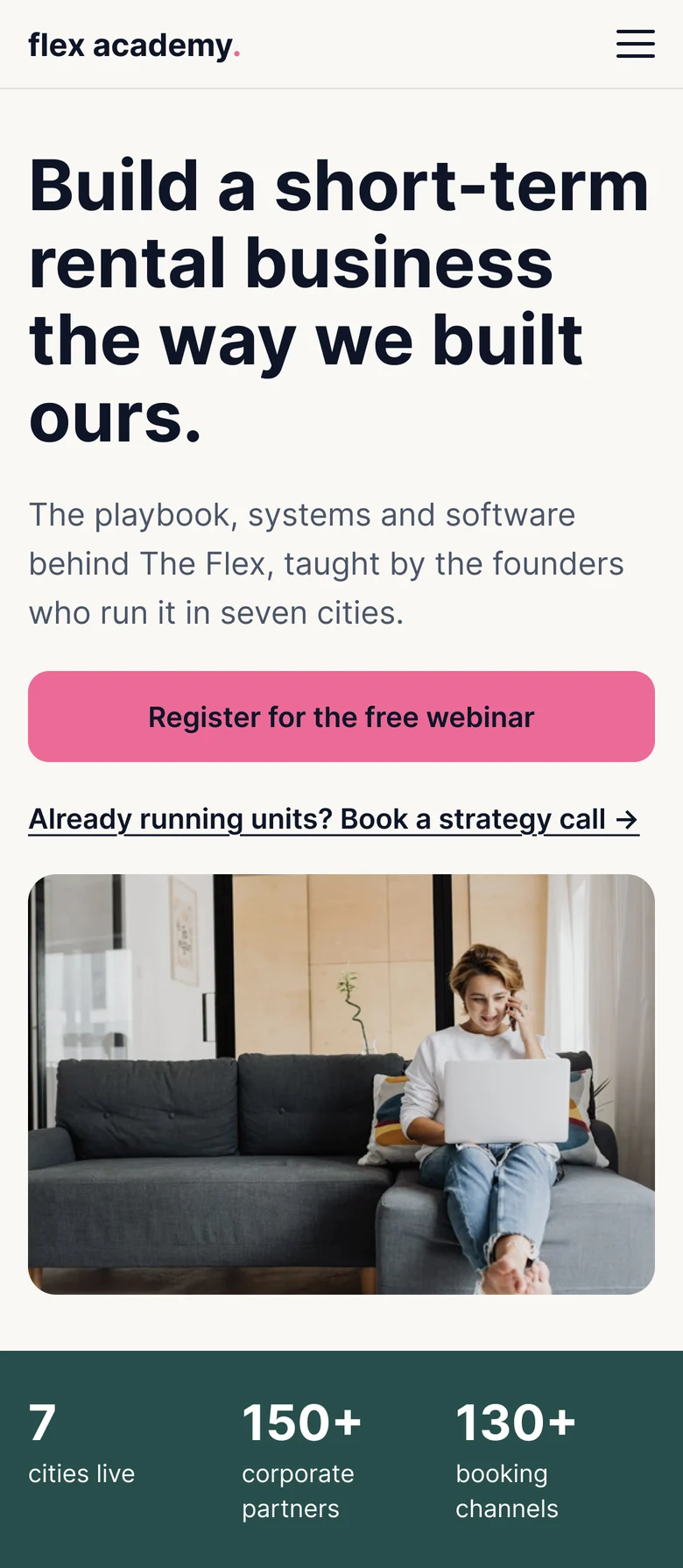
The full Flex Academy landing page scrolling inside a laptop, from the hero to the footer
Brief

A visitor understands who it's for in 5 seconds, trusts it in 30, and can act at any point of the scroll.

Audience

Two people: the 9-to-5 leaver who wants to start safely, and the early operator stuck on manual work.

Approach

Do the opposite of guru courses: no income promises, countdowns or strikethrough prices. Proof over promise.

Three key decisions

Proof over promise

No income claims, countdowns or strikethrough prices. Trust rests on what the founders run: seven cities, 150+ partners and their own software.

Colour tells the brand story

The Academy owns off-white, ink and pink. The Flex green and Base360 blue appear only where that sibling is the evidence. Pink is reserved for primary CTAs.

Commitment matched to intent

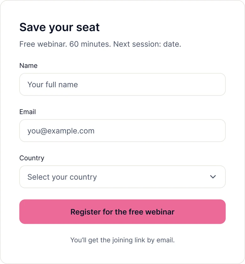
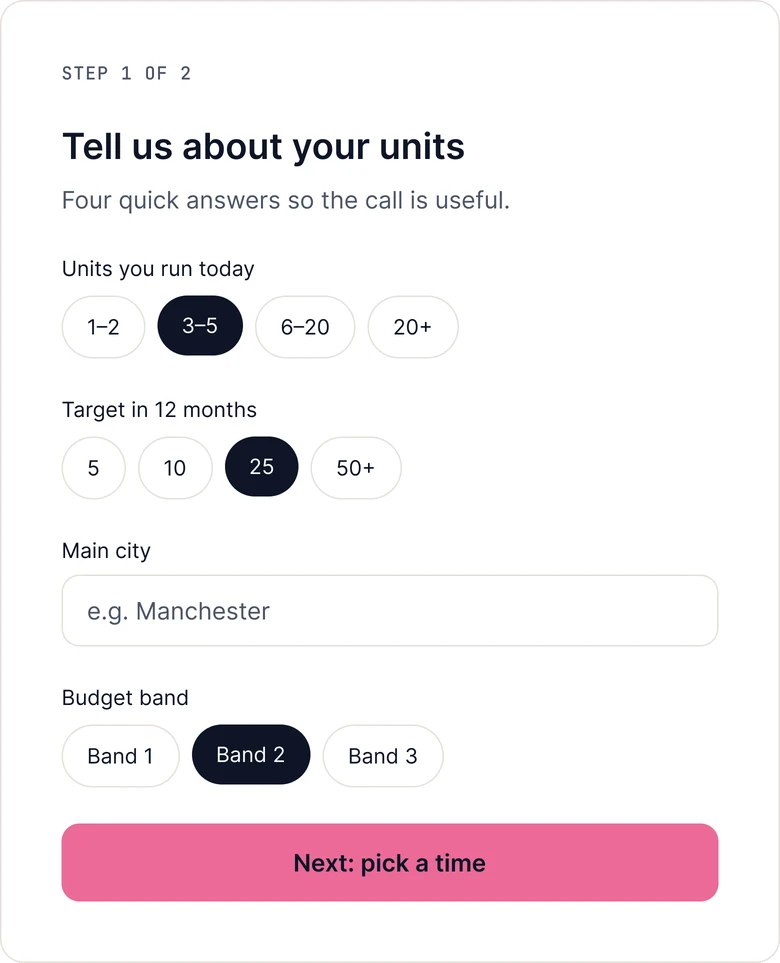
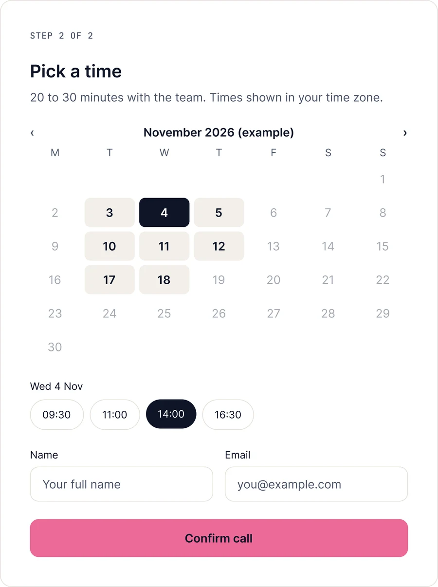
Webinar: three fields in a modal. Strategy call: tap-to-choose questions, then a calendar. On mobile, a sticky CTA and a one-at-a-time comparison.

UI design

1Paths

Split by situation, not product name

What I designed

Two path cards, "Starting your first unit" and "Growing past a few units", with the free webinar as the pink primary action.

Why it matters

Visitors recognise themselves before learning programme names. Launch leads because a free webinar is a much smaller ask than a call.
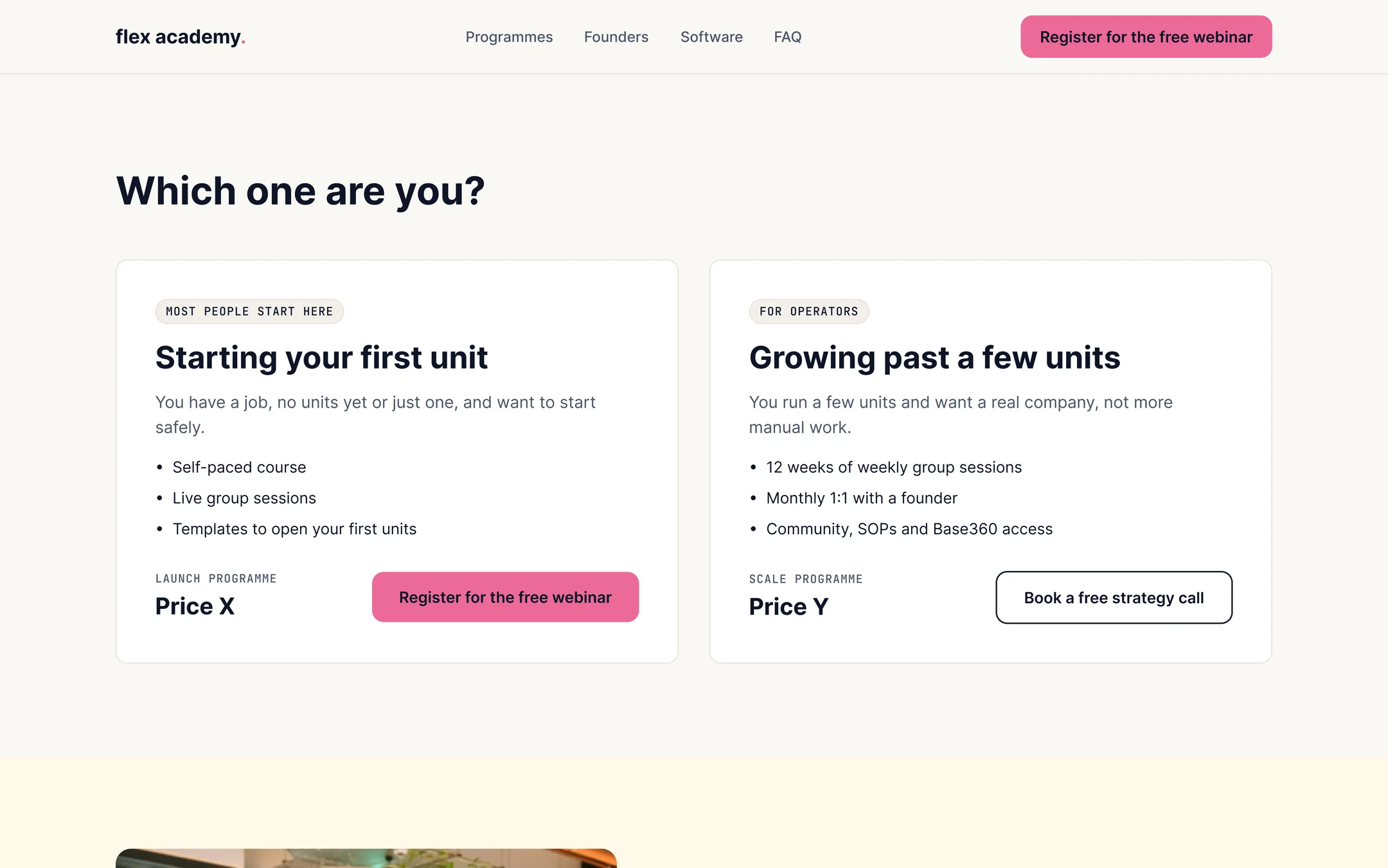
Two path cards: Starting your first unit (Launch) and Growing past a few units (Scale)
2Offer

A 12-week plan you can see

What I designed

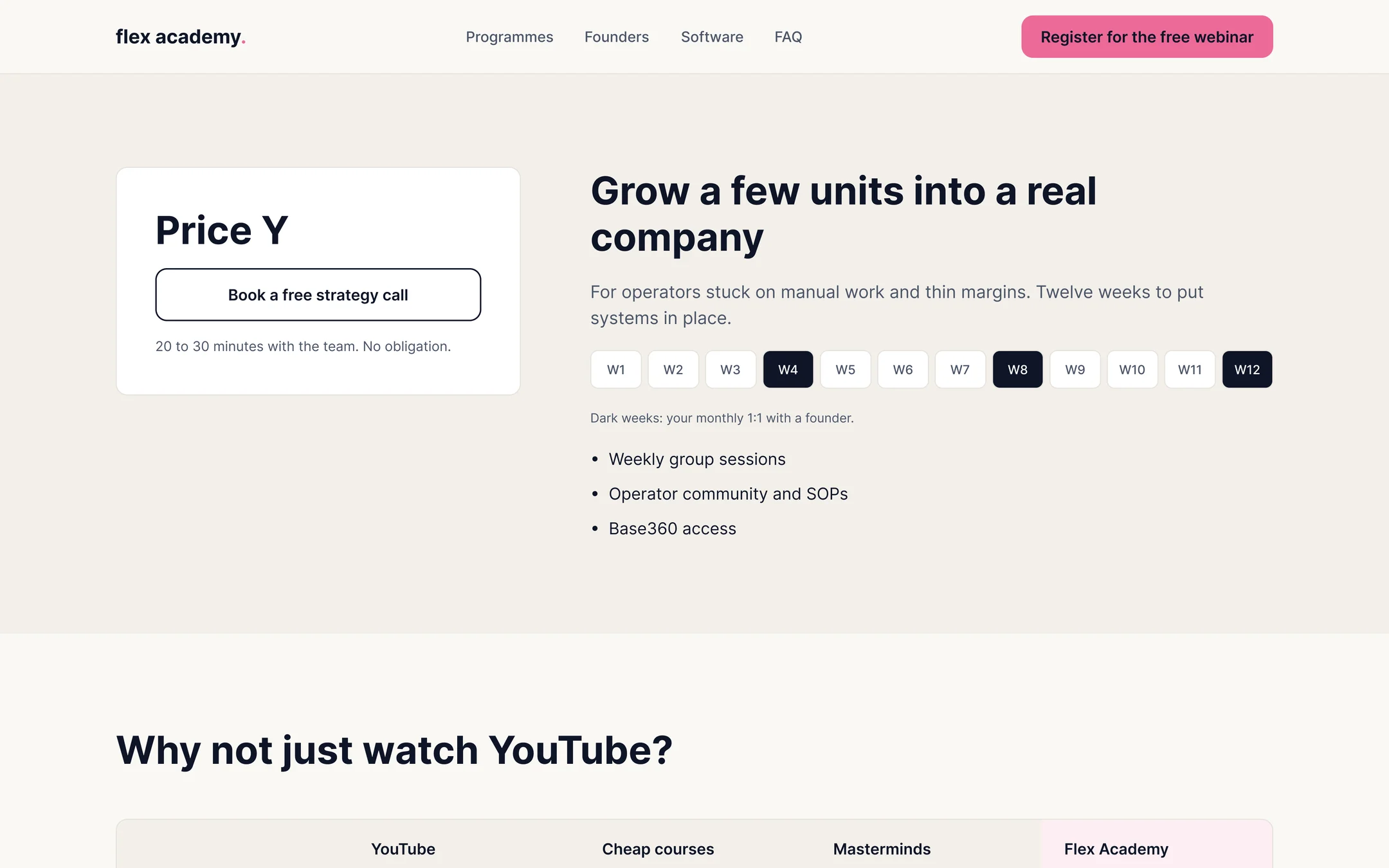
The Scale offer shows the price plainly and a week-by-week timeline, with the founder one-to-ones marked in ink.

Why it matters

It shows what you actually get, week by week, instead of promising results.

Scale offer with Price Y, a strategy call button and a 12-week timeline with founder one-to-ones marked
3Comparison

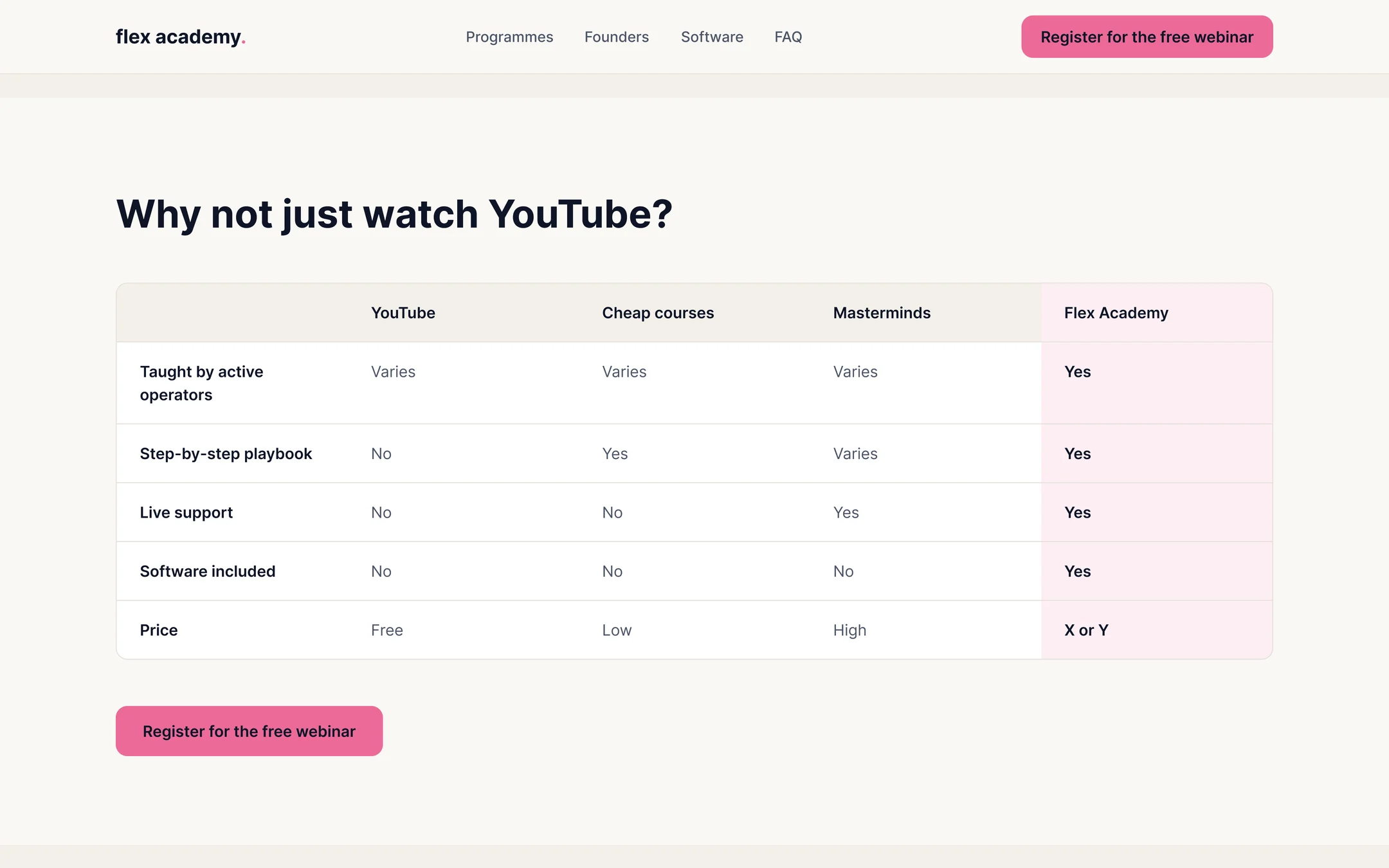
Answer the question they already have

What I designed

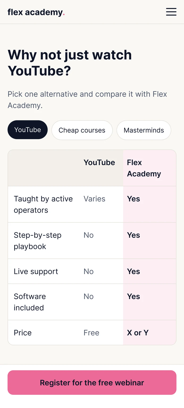
A comparison that opens with "Why not just watch YouTube?", setting Flex Academy against free courses, cheap courses and masterminds.

Why it matters

Sceptical visitors are already comparing. Meeting that question honestly builds more trust than avoiding it.

Comparison table: YouTube, cheap courses, masterminds and Flex Academy

Three brands, one family

Palette
Off-whiteAcademy
InkAcademy
PinkPrimary CTA only
Flex greenThe Flex, as proof
Base360 blueBase360, as system
Typography

Inter and JetBrains Mono

The Flex is the proof ("we did it"), Base360 the system ("how we run it") and the Academy the teaching ("how you do it"). Type and corner radius are shared with both siblings, so the family feels related without blending.

Conversion flows

Every button state, form, error and confirmation for both offers.

Flow A: Webinar registration (Launch)

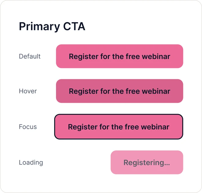
Button states
Primary CTA button states: default, hover, focus and loading
Form, opens as a modal over the page
Save your seat form with name, email and country
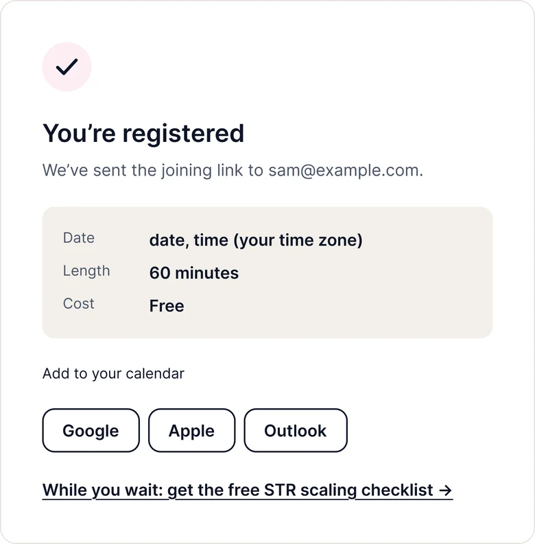
Confirmation
You are registered confirmation with date, length, cost and calendar buttons

Flow B: Strategy call booking (Scale)

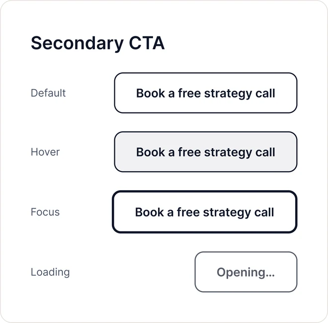
Button states
Secondary CTA button states: default, hover, focus and loading
Step 1 of 2: qualifying form
Tell us about your units: tap-to-choose questions about units, target, city and budget
Step 2 of 2: calendar
Pick a time: calendar, time slots, name and email
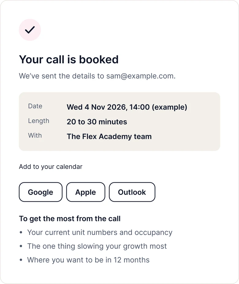
Confirmation
Your call is booked confirmation with details and preparation tips

From desktop to mobile

Copy and the button come before the image. The comparison becomes one alternative at a time, picked with chips, with a sticky CTA.

Contact

Let's make something people trust.

I'm open to full-time Product Designer roles in AI. I usually reply within a day or two.

hello@prisjanuario.com