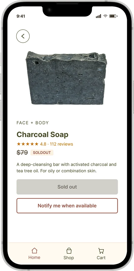
Sold out
A disabled button and a clear "Notify me when available" path keep interest alive.
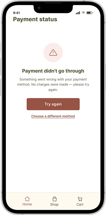
Payment failed
Reassures that no charges were made, then offers Try again or a different method.
A calm, intuitive, mobile-first e-commerce experience for Minze, a brand crafting natural, handcrafted soaps rooted in sustainability and minimalist living.

Conscious consumers face cluttered digital storefronts and widespread greenwashing.
Translate Minze's core values into a seamless shopping journey that drives direct-to-consumer sales and brand loyalty.
+24% mobile conversion, 18% less checkout drop-off and 40% fewer steps from cart to confirmation.
What conscious shoppers ran into on competitors' stores.
Competitors list ingredients vaguely, leaving shoppers guessing.
Visual identities feel sterile or overly corporate, not natural or calm.
Friction-heavy, multi-step checkouts erode trust and drive cart abandonment.

31 years old, yoga instructor
Mindful shopper based in São Paulo, shopping mostly on mobile.
Calming visual spaces
Unverified sustainability claims
Full ingredient transparency before buying
Vague labels and hidden additives make shoppers with sensitive skin hesitate.
Cluttered layouts and loud marketing tactics wear shoppers down.
Long checkouts that require creating an account make people give up.
Full, transparent ingredients within a tap.
Scent notes that make a soap feel real.
Frictionless payment with one tap.
A 4-column mobile grid and a short, linear path to purchase.
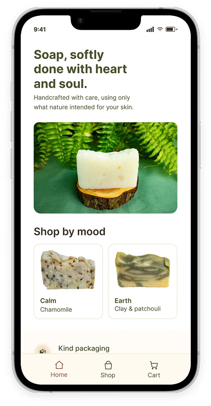
A clean, legible hierarchy that keeps every screen calm. Earthy neutrals and organic photography communicate authenticity and calm.
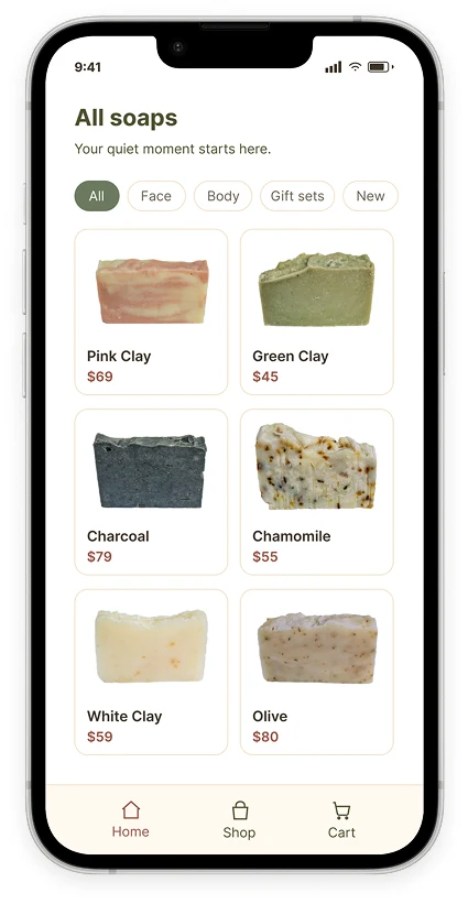
Nature-inspired imagery, mood-based shopping and clear pricing keep decisions simple.
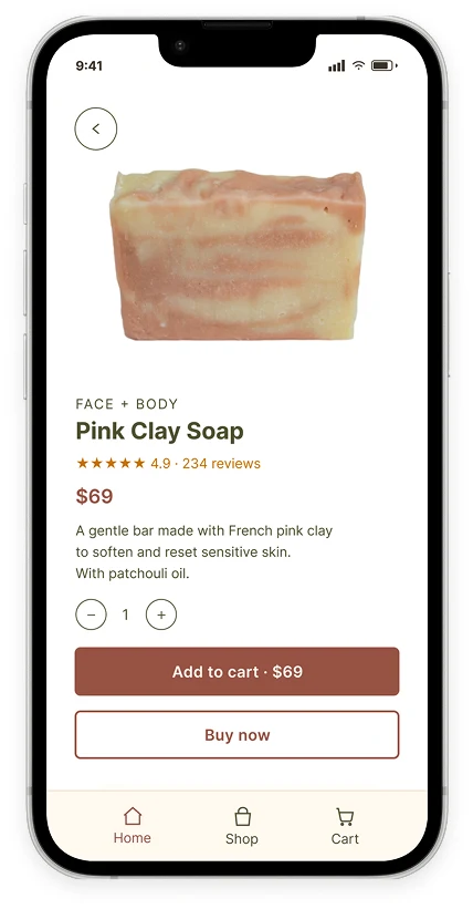
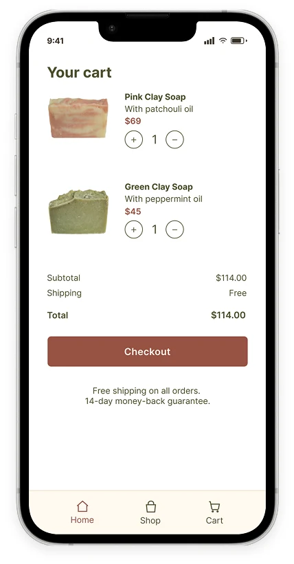
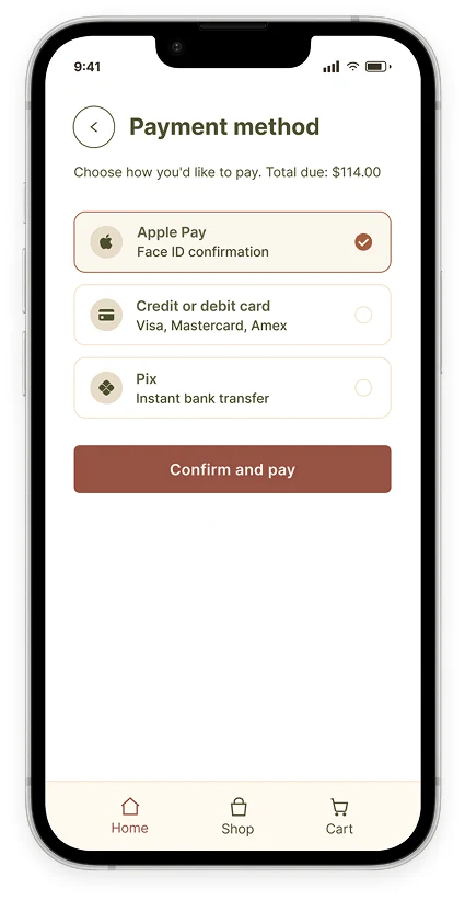
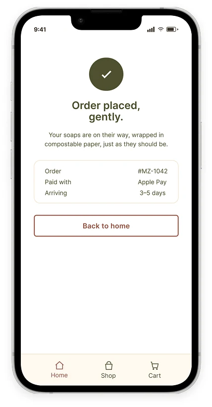
I moved from low-fidelity wireframes to interactive high-fidelity prototypes with:
Every product shows what's inside, in plain language.
Social proof shoppers can trust.
Apple Pay built into checkout.
A disabled button and a clear "Notify me when available" path keep interest alive.
Reassures that no charges were made, then offers Try again or a different method.
Clear product information and prominent scent profiles turned browsing into completed purchases.
Express payment (Apple Pay) and guest checkout removed friction at the last step.
Reduction in steps from cart to confirmation.
I'm open to full-time Product Designer roles in AI. I usually reply within a day or two.